Pie Chart Enriches Spatial Data
Table of Contents
Pie Chart Enriches Cell Type Deconvolution in Spatial Transcriptomics Data
Spatial transcriptomics has greatly enhanced our understanding of cell type composition within tissues and organs by adding critical spatial context—such as neighborhood relationships, cell-cell interactions, and region-specific biological events.
Before single-cell resolution techniques like 10x Xenium became available, many researchers relied on platforms like the earlier 10x Visium array (not HD version). Although Visium is an excellent, cost-effective, and accessible platform—especially valuable for initial screening—it doesn’t offer single-cell resolution. As a result, when aiming to investigate detailed cell type composition (rather than just regions of interest), a cell type deconvolution step becomes necessary.
Deconvolution algorithms estimate the probability or proportion of various cell types within each spatial spot. Given that each spot on a standard 10x Visium slide (non-HD) may contain 5–10 cells—or even more (my observation, subject to cell type and their morphologies), depending on cell type and morphology—it becomes important to visually represent these mixed compositions clearly and intuitively.
That’s where pie charts come in. By visualizing the deconvolution results as pie charts for each spatial spot, we can more vividly convey the potential cell types present and their relative abundances. Whether representing probabilities or proportions, this approach helps bridge quantitative results with spatial intuition.
In this post, I’ll show how to take output from RCTD and convert it into a pie chart–powered spatial map, highlighting detailed cell type composition spot by spot.
⚠️ The data shown here is not from a public dataset, so you may need to adjust the code for your own data. I also skip the upstream steps like running RCTD, as the output format is consistent enough that adapting the visualization code should be straightforward. Even if you’re not using RCTD, this visualization concept applies broadly to any deconvolution results. Have fun exploring your own data!
# QUICK WRAP INTO A FUNCTION
deconvoluted_piechart <- function(
    rctd_results,
    rotation = 0,
    flip_x = FALSE,
    flip_y = FALSE,
    cell_type_display = NULL,
    cell_type_order = NULL,
    cell_type_color = NULL,
    saved_file_path = NULL,
    file_width = 14,
    file_height = 8,
    ...
) {

  # ---------------------------
  # 1. Proper checks
  # ---------------------------
  if (!methods::is(rctd_results, "RCTD")) {
    stop("rctd_results must be an RCTD object.")
  }

  results <- rctd_results@results
  cell_type_names <- rctd_results@cell_type_info$info[[2]]
  visium_coords <- rctd_results@spatialRNA@coords

  rotation <- rotation %% 360
  if (!rotation %in% c(0, 90, 180, 270)) {
    stop("rotation must be 0, 90, 180, or 270.")
  }

  # ---------------------------
  # 2. Build weight matrix (clean)
  # ---------------------------
  weight_matrix <- matrix(
    0,
    nrow = length(results),
    ncol = length(cell_type_names),
    dimnames = list(rownames(visium_coords), cell_type_names)
  )

  for (i in seq_along(results)) {
    ct <- results[[i]]$cell_type_list
    w  <- results[[i]]$sub_weights
    weight_matrix[i, ct] <- w
  }

  Res4Plot <- cbind(
    imagerow = visium_coords[, 1],
    imagecol = visium_coords[, 2],
    weight_matrix
  )

  Res4Plot <- as.data.frame(Res4Plot)

  # ---------------------------
  # 3. Remove empty cell types
  # ---------------------------
  keep <- colSums(Res4Plot[, -(1:2)]) > 0
  cell_type_names <- cell_type_names[keep]
  Res4Plot <- Res4Plot[, c("imagerow", "imagecol", cell_type_names)]

  message("Cell types found: ", paste(cell_type_names, collapse = ", "))

  # ---------------------------
  # 4. cell type subsetting and ordering
  # ---------------------------
  if (!is.null(cell_type_display)) {
    # keep only displayed types
    display <- intersect(cell_type_display, cell_type_names)
    if (length(display) == 0) stop("None of the cell_type_display are present in the data.")
    Res4Plot <- Res4Plot[, c("imagerow", "imagecol", display)]
    cell_type_names <- display
  }

  if (!is.null(cell_type_order)) {
    # ensure ordering matches displayed types
    cell_type_order <- intersect(cell_type_order, cell_type_names)
    if (length(cell_type_order) == 0) stop("No cell types in cell_type_order are in the displayed data.")
    # reorder columns
    Res4Plot <- Res4Plot[, c("imagerow", "imagecol", cell_type_order)]
    cell_type_names <- cell_type_order
  }

  # ---------------------------
  # 5. Rotation
  # ---------------------------
  x <- Res4Plot$imagecol
  y <- Res4Plot$imagerow

  if (rotation == 90) {
    rot_x <- -y
    rot_y <-  x
  } else if (rotation == 270) {
    rot_x <-  y
    rot_y <- -x
  } else if (rotation == 180) {
    rot_x <- -x
    rot_y <- -y
  } else {
    rot_x <- x
    rot_y <- y
  }

  Res4Plot$rot_x <- rot_x
  Res4Plot$rot_y <- rot_y

  # ---------------------------
  # 6b. Handle colors smartly
  # ---------------------------
  if (is.null(cell_type_color)) {
    # generate default colors automatically
    library(RColorBrewer)
    n <- length(cell_type_names)
    if (n <= 12) {
      palette <- brewer.pal(max(3, n), "Set3")
    } else {
      palette <- grDevices::rainbow(n)
    }
    cell_type_color <- setNames(palette[1:n], cell_type_names)
  } else {
    # subset and match colors to displayed/ordered cell types
    missing_colors <- setdiff(cell_type_names, names(cell_type_color))
    if (length(missing_colors) > 0) {
      warning("Some cell types have no color assigned: ", paste(missing_colors, collapse = ", "),
              ". Assigning default colors to them.")
      default_colors <- grDevices::rainbow(length(missing_colors))
      cell_type_color[missing_colors] <- default_colors
    }
    # subset to displayed types only, in the right order
    cell_type_color <- cell_type_color[cell_type_names]
  }

  # ---------------------------
  # 6. Plot
  # ---------------------------
  p <- ggplot2::ggplot(Res4Plot) +
    scatterpie::geom_scatterpie(
      aes(x = rot_x, y = rot_y),
      cols = cell_type_names,
      pie_scale = 0.8,
      sorted_by_radius = TRUE
    ) +
    ggplot2::coord_fixed(clip = "off") +
    ggplot2::theme_void() +
    ggplot2::guides(fill = guide_legend(title = "Cell Type", ncol = 1)) +
    ggplot2::theme(
      legend.position = "right",
      legend.text = ggplot2::element_text(size = 14),
      legend.title = ggplot2::element_text(size = 14)
    )

  if (!is.null(cell_type_color)) {
    if (!all(cell_type_names %in% names(cell_type_color))) {
      stop("cell_type_color must be a named vector matching cell types.")
    }
    p <- p + ggplot2::scale_fill_manual(values = cell_type_color)
  }

  # Apply optional additional ggplot layers passed via ...
  if (!missing(...)) p <- p + list(...)

  if (flip_x) p <- p + ggplot2::scale_x_reverse()
  if (flip_y) p <- p + ggplot2::scale_y_reverse()

  # ---------------------------
  # 7. Save or return
  # ---------------------------
  if (!is.null(saved_file_path)) {
    ggplot2::ggsave(
      filename = saved_file_path,
      plot = p,
      width = file_width,
      height = file_height
    )
  }

  return(p)
}
# 🚀 Quick Demo: Running RCTD for Cell Type Deconvolution
# You’ll need two datasets:
# 1. Reference data from scRNA-seq (e.g., from Seurat)
# 2. Spatial transcriptomics data (e.g., 10x Visium)
# Both datasets should be preprocessed using Seurat in R (at least for my case).

# Extract count matrix and cell type annotations from the scRNA-seq reference
counts = YourRefData@assays$RNA$counts
cell_types = YourRefData$CellType # Cell types annotated in your scRNA-seq data

# Convert cell types to a factor and name them by cell barcode
cell_types = as.factor(cell_types)
names(cell_types) = colnames(counts)

# Extract UMI counts per cell
nUMI = YourRefData$nCount_RNA
names(nUMI) = colnames(counts)

# Create the Reference object
reference = Reference(counts, cell_types, nUMI)

# --- Prepare Spatial Transcriptomics Data (e.g., Visium) ---

# Extract raw count matrix and spatial coordinates
A1_count = GetAssayData(YourVisiumData, assay = "Spatial", slot = "counts")
A1_coords = GetTissueCoordinates(YourVisiumData, which = "centroids")
A1_coords$cell = NULL   # Clean up if necessary

# Create SpatialRNA object for RCTD
query = SpatialRNA(A1_coords, A1_count, colSums(A1_count))

# --- Run RCTD ---

# Create the RCTD object
RCTD = create.RCTD(query, reference, max_cores = 8)

# Run RCTD in doublet and multi mode
RCTD_doublet = run.RCTD(RCTD, doublet_mode = "doublet")
RCTD_multi = run.RCTD(RCTD, doublet_mode = "multi")
In the next, I show you the code of how to make the Pie Chart plot:
# 🎨 Visualizing Cell Type Deconvolution Results from RCTD

# Define colors for cell types (optional but recommended for clarity in plots)
cluster_color_lev1 <- c("T cell" = "#F6222E", "B cell" = "#00FFBE", ....)

# Extract RCTD results and metadata
results_A1 <- RCTD_doublet@results
cell_type_names_A1 <- RCTD_doublet@cell_type_info$info[[2]]  # Vector of cell type names
spatialRNA_A1 <- RCTD_doublet@spatialRNA

# Prepare dataframe for plotting
Res4Plot_A1 <- data.frame(matrix(ncol = length(cell_type_names_A1) + 2, nrow = nrow(A1_coords)))
colnames(Res4Plot_A1)[1:2] <- c("imagerow", "imagecol")
Res4Plot_A1[, 1:2] <- A1_coords
rownames(Res4Plot_A1) <- rownames(A1_coords)
colnames(Res4Plot_A1)[3:ncol(Res4Plot_A1)] <- cell_type_names_A1

# Format doublet result weights
doublet_results_A1_celltype <- results_A1[[1]]
doublet_results_A1_weight <- results_A1$weights_doublet
colnames(doublet_results_A1_weight) <- paste0("weight_", colnames(doublet_results_A1_weight))

# Merge weights with cell type info
doublet_results_A1 <- merge(doublet_results_A1_celltype, doublet_results_A1_weight, by = "row.names")
doublet_results_A1 <- doublet_results_A1[, c(1, 3:4, 11, 12)]

# Populate Res4Plot_A1 with the dominant cell type and weight per spot
for (i in 1:nrow(Res4Plot_A1)) {
  row_idx <- rownames(Res4Plot_A1)[i]
  temp <- doublet_results_A1[doublet_results_A1$Row.names == row_idx, ]
  if (nrow(temp) > 0) {
    Res4Plot_A1[i, which(colnames(Res4Plot_A1) == temp$first_type)] <- temp$weight_first_type
  }
}

# Fill any NAs with 0
Res4Plot_A1[is.na(Res4Plot_A1)] <- 0

# Annotate spots with inferred cell types (can be single or multiple)
Res4Plot_A1$CellType <- apply(Res4Plot_A1[, 4:ncol(Res4Plot_A1)], 1, function(row) {
  present_types <- names(row)[which(row != 0)]
  if (length(present_types) > 0) paste(present_types, collapse = ", ") else NA
})

# Optional cleanup: relabel and reorder factor levels
Res4Plot_A1$CellType <- gsub("^Prolif T$", "T cell", Res4Plot_A1$CellType)
Res4Plot_A1$CellType <- factor(
  Res4Plot_A1$CellType,
  levels = c("T cell", "Myeloid", "Fibroblast", "Epithelial",
             "Keratinocyte", "Endothelial", "Muscle")
)

# 🖼 Plot: Cell type per spatial spot using ggplot2
ggplot(Res4Plot_A1, aes(x = imagecol, y = imagerow, color = CellType)) +
  geom_point(size = 3) +
  xlim(min(Res4Plot_A1$imagecol) - 55, max(Res4Plot_A1$imagecol) + 55) +
  ylim(max(Res4Plot_A1$imagerow) + 55, min(Res4Plot_A1$imagerow) - 55) +
  scale_color_manual(values = cluster_color_lev1) +
  guides(fill = guide_legend(title = "Cell Type")) +
  theme_void() +
  theme(
    legend.position = "right",
    legend.text = element_text(size = 12),
    legend.title = element_text(size = 12)
  )
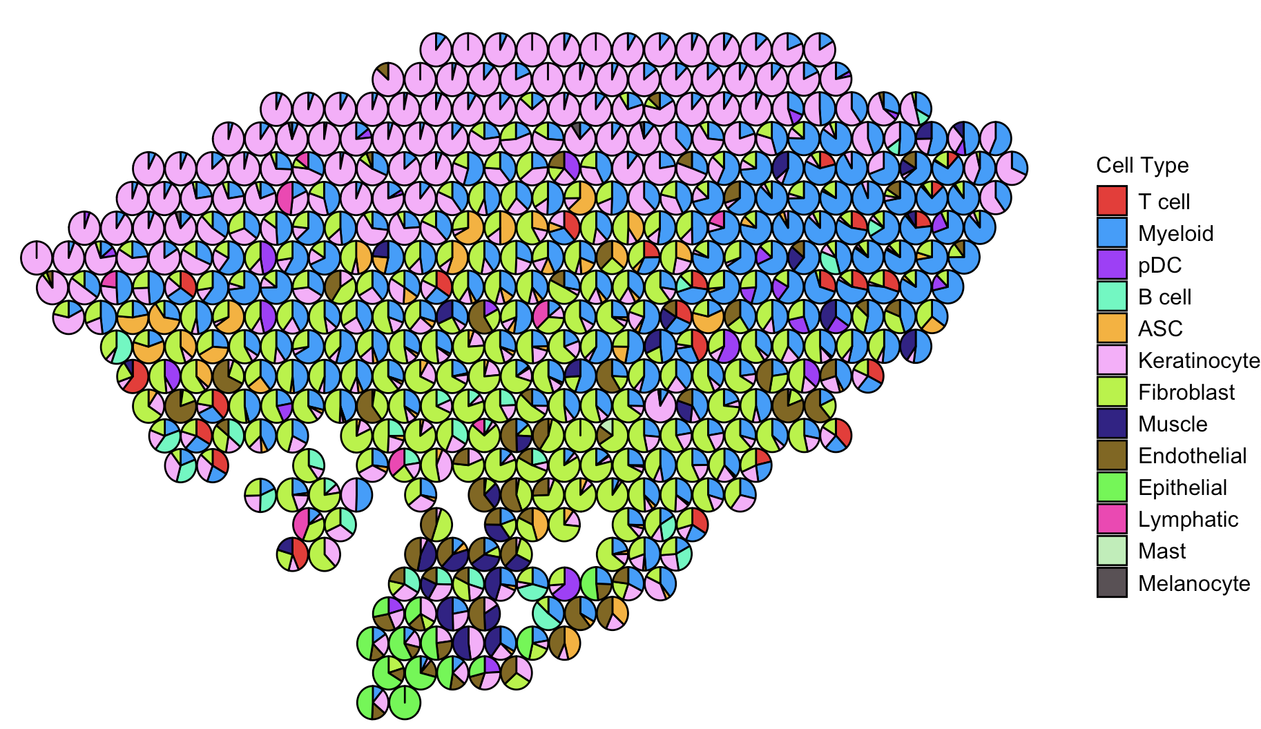
Well, the plot looks fantastic—it captures both the spatial distribution and the cell type composition. Yayyy! 🎉
That said, if you’re projecting many cell types onto the spatial data, the plot can get really busy. It might become hard to distinguish certain cell types, especially those that are low in abundance.
One quick trick to make your plot more readable is to mute the cell types you’re not interested in by assigning them a white color. This way, the cell types you do care about will pop out more clearly. I’m not including the code here since it’s just a small tweak—you can definitely pull it off!
Of course, this is just a trick, not a perfect solution. Ideally, if we could add quantitative info—like showing the percentage of each cell type per spot on the pie chart—that would be amazing. But let’s be honest, the plot might end up looking like a total mess.
So, here’s a better idea: make it interactive using plotly! When you hover over a spot, it’ll display the percentage breakdown of cell types for that specific spot. Below is the code for the interactive version. The setup is mostly the same as before, so I’m just showing the part that handles the interactive output.
# Loop through each spatial spot to overlay pie charts
for (i in 1:nrow(Res4Plot_A1)) {
  row_data <- Res4Plot_A1[i, ]

  # Extract cell type proportions for the current spot
  pie_values <- as.numeric(row_data[cell_type_names_A1])
  pie_labels <- cell_type_names_A1
  pie_colors <- colors[pie_labels]

  # Keep only the non-zero cell types to avoid plotting empty slices
  non_zero_idx <- which(pie_values > 0)

  if (length(non_zero_idx) > 0) {
    fig <- fig %>%
      add_pie(
        labels = pie_labels[non_zero_idx],               # Cell type labels
        values = pie_values[non_zero_idx],               # Corresponding cell type proportions
        domain = list(                                   # Controls position of the pie chart in plot space
          x = c((row_data$imagecol - x_min) / (x_max - x_min) - 0.02,
                (row_data$imagecol - x_min) / (x_max - x_min) + 0.02),
          y = c((row_data$imagerow - y_min) / (y_max - y_min) - 0.02,
                (row_data$imagerow - y_min) / (y_max - y_min) + 0.02)
        ),
        marker = list(colors = pie_colors[non_zero_idx]),  # Color each slice by cell type
        textinfo = "none",                                 # Disable default text inside pie slices
        showlegend = FALSE,                                # Hide individual pie legends
        hoverinfo = "label+percent"                        # Show cell type and % on hover
      )
  }
}

# Customize the layout of the overall plot
fig <- fig %>%
  layout(
    title = "",  # No plot title
    xaxis = list(
      title = "Image Column",
      range = c(x_min, x_max),
      zeroline = FALSE,
      showgrid = FALSE
    ),
    yaxis = list(
      title = "Image Row",
      range = c(y_max, y_min),       # Reversed y-axis to align with image orientation (like ggplot)
      zeroline = FALSE,
      showgrid = FALSE,
      autorange = "reversed"
    ),
    showlegend = TRUE                # Enable legend (for color reference, not individual pies)
  )

# Render the plot
fig
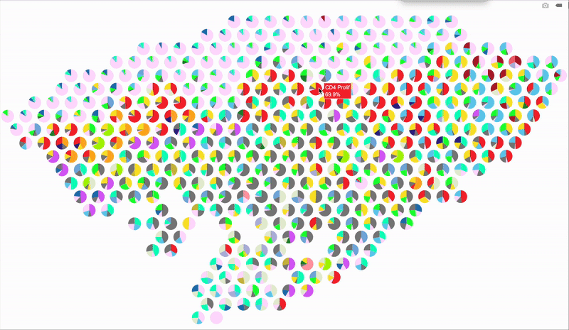
Hope this trick gives your spatial plots a new spark—stay creative and have fun visualizing those cell maps!